Future Primitives
When the Rez Gallery in Olney, Illinois, approached me to create a new corporate identity, they were looking for something that communicated the dichotomy between the primitive roots of their production process and the modern works of art they were producing.
The brand manual I developed for them was a work of art in its own right. I captured the studio's spirit by combining earthy materials like hand-screened recycled paper in combination with manufactured elements like brass rivets and aluminum bars to bind the pages.
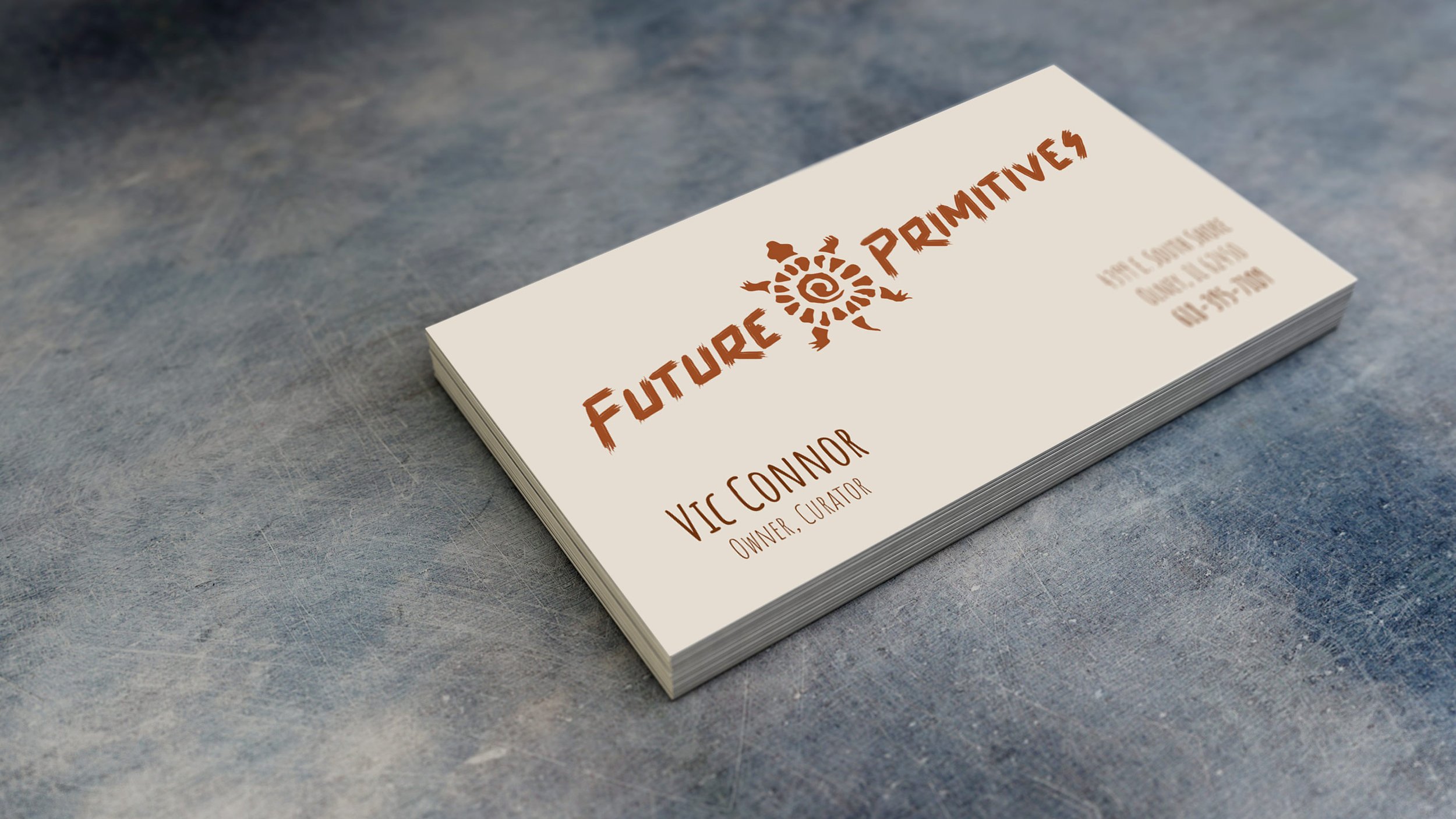
We renamed the gallery "Future Primitives" after a product line they produced and sold when exhibiting at the art fair circuit. The logo combines three symbols common to ancient civilizations around the globe; the sun, spiral, and turtle. The typeface’s worn edges resemble the texture left behind when an artist scratches their name into unfired ceramic artwork.
I incorporated vellum overlays in key areas of the manual to help communicate additional information on the underlying page. The vellum also promotes the contrast between the manufactured and earthy materials. This disparity between nature and manufacturing is crucial to the gallery’s philosophy and the identity manual itself.


